Look, there is certainly no ‘one size fits all’ design technique that will magically fix each and every space, but today I wanted to share some tips that can help to get the most out of your home’s appearance. When I tell you guys that I’ve had to get creative with each and every detail of the home we are currently in, I truly mean it. We are a family with 2 adults, 2 toddlers, 2 dogs and a cat…. We transitioned from living with over 3000sqft of living/storage space to maybe 700sqft of living space and practically zero storage. I’ve wracked my brain thousands of times, hours on end, on how I can possibly make this space feel bigger and more welcoming than it is and while I haven’t fully cracked the code, I do have some tips that have helped me in our home.
Clean and Simple Colors
So, what do I mean by this? Do I mean eliminate all of the character from your space? Do I mean paint all of your walls and furniture white? Absolutely not. However, I do recommend keeping certain things relatively neutral and then decorating around them. Think more along the lines of creams, tans, grays, taupes, and greiges. Areas and aspects I recommend keeping moderately neutral would be: overall paint colors, large furniture pieces (couches, beds, etc.), blinds, and major textiles such as bedding and rugs, as they aren’t as easy to swap out and have a larger impact on your design. I promise you can still have that olive or blush accent wall. You can still have a fun accent color or running theme in each unique space. But, when it comes to the more permanent aspects of your design, think timeless, clean, and simple - especially if you are like me and want to make your small space appear bigger and brighter.
So how do you keep it fun, unique and creative? It’s pretty simple. Through the more versatile and interchangeable items such as pillows, throw blankets, curtains, plants, wall art, and general décor items. If you’re like me, you have a strong urge to change these items out a few times a year. I typically like storing items and making swaps at the start of each new season to bring life to each space. The best part is that I get to shop my own items instead of having to purchase new items when I’m ready for a refresh. Below I’m going to list some of my favorite neutral paint colors, bedding, furniture, rugs, and blinds.
Curtain Placement and Height
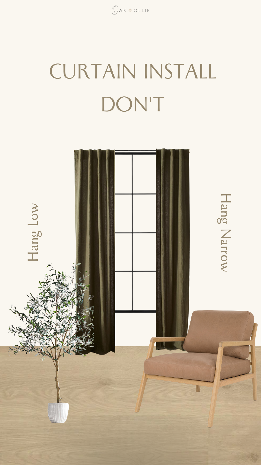
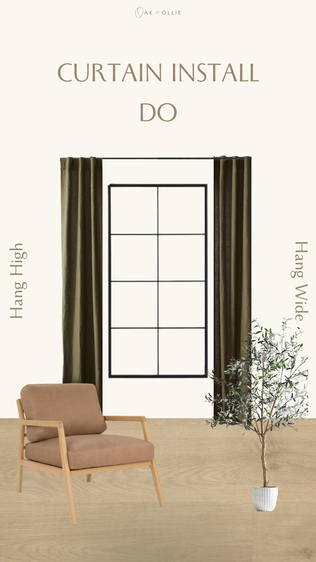
This is an extremely easy one and you may already have implemented this in your home. If not, it’s an easy fix to make that will go a long way in the end result of your space. This tip especially helps to make your ceilings appear higher and your windows to appear larger. Somewhere along the way, some of us were convinced that we had to install our curtain rods in line with the top of our window trim and at the same width as the window…. This completely limits your visibility and takes away so much from the look of your home design. So how do we fix this? You’re going to want curtain rods that are at least 10”-18” wider than your windows. Depending on the thickness of your curtains, you’ll want to have more room on each side for them to be drawn back. For example, a rod 10” wider than your window frame gives you 5” on each side for fabric to bunch up when pulled back. For thicker fabric, you’ll want to ensure you have plenty of space for the fabric to clear the window opening and may need more like 6”-9” on each side of the window. The main focus is to just ensure that the fabric doesn’t cover any of the glass or the trim of the window to allow ample visibility.


As for height, there can be more limitations with this such as the height of your ceilings and the height of your windows. In our last home, we had 9’ ceilings and in our current house, most are 8’, meaning I have less space above the window for curtain rod placement. In general, the goal would be to hang them at least 3”-6” above the top of the windows trim. Depending on the look you’re going for, you can go even higher. This simple trick will help to make your walls feel and appear taller than they are, making your overall space feel bigger and brighter. Be sure to double check the length of your curtain panels to ensure they are the height you are going for. I tend to like my curtains to fall just above my baseboard molding, whereas some might like them a few more inches from the floor and others may prefer that they ‘sweep’ the floor.
Wood Tones
No, I’m not telling you that you must rid your home of all items with a darker wood tone or you have to match every single wood piece to the last!! Though, I’m never opposed to a re-finishing project or sticking to a scheme…. In all honestly, I’m a fan of mixed wood tones to a certain degree and believe it adds necessary character to a home. Our house is filled with furniture made by my husband, my father-in-law, furniture we have purchased, and family heirlooms. With wood, no one piece is the same. Each individual piece of wood is unique and can age over time. Some woods yellow/orange, some turn more red/pink, and some even go towards a more green or purple undertone depending on the type of wood and the finish applied. That’s the true beauty of wood, it’s uniqueness! What I recommend though is doing your best to limit your wood tone family throughout your home. Maybe you have a few finishes that you love that all somewhat tie in together and compliment one another. A simple way to brighten your space and make it feel more inviting and open is to incorporate more light wood tones. This can be achieved through flooring, cabinetry, accent walls, ceilings, and furniture pieces. A cohesive design is extremely important and will make your space appear as well-crafted and though out.
Wall Décor
Wall décor can make or break a space. The thing I tread most carefully with is typically the items I hang on my walls. In all honesty, it’s typically the last thing I plan for or shop for, as I like to see the rest of the space come together first so I have a color scheme, concept of size, etc. Mirrors - Mirrors can have such a positive impact on small or dark spaces. They bring function as well as offer light to reflect off of them. If you have an open wall that you aren’t sure what to do with: large mirror. Try a unique shape, a complimentary tone to the rest of your home (think wood framed, black framed, gold framed, boho framed), or even a floor mirror to maximize visibility. I promise you won’t be upset with adding a mirror to your space! Every single room should have one, if you ask me at least.
Paintings – simple here, I like to stick to neutrals with subtle pops of color. That way, if you change out your seasonal décor, your wall art still flows well. Portraits – so many ways to showcase your family’s photos. One of my favorites ways is large canvases followed by framed gallery walls. For a more cohesive look, try to limit your photos to compliment one another. For example, think black and white images grouped together or colored images with the same style editing or filters grouped together with matching or complimentary frame finishes.
Lighting
Do not be afraid to change out your lighting. I repeat, do not be afraid! I promise this is one of the most impactful ways to change your space! Although decorative lighting has a reputation of being expensive, there are tons of budget friendly options if you have some time to dig around online. Re-wiring a light fixture takes minutes and can seriously give the wow-factor you’re looking for. Don’t use that ceiling fan? Don’t be afraid to replace it with a fun pendant or chandelier. Have a dated ‘boob light’ in your hallway? Replace it with a more modern flush-mount option. Bathroom needs a refresh? Simply changing your lighting is SO impactful. In our home, we have had to get extremely creative with lighting, as our main living space has one single fixture to light the kitchen, living, and dining space. Granted, they are all essentially the same space and steps from one another... but it can be dark and less than inviting…. Our bedroom has zero overhead lighting in it, so we have depended on floor lamps and table lamps with the help of a fun gadget I found that gives us a “switch” to control them when we walk in the door. While trying to make it more appealing, we recently discovered a few battery-operated/rechargeable wall sconces and plan to incorporate those in a couple of DIY’s coming soon, so stay tuned. I’ll link some of my favorite lighting upgrades here too from some of my top budget friendly sites!! I highly recommend Amazon, Wayfair, Overstock, and West Elm.
I’m not telling you to make all of these changes overnight, so don't fret! I just want to share the design knowledge I have and let all of you know that it is possible to have a home you love that offers you peace and pride, while sticking to your budget and having a little bit of patience!! A big goal of mine is to offer more simple DIY blogs and videos to show how easily these things can be accomplished!! Follow us on Instagram and TikTok, as that is where most of our content is shared. Thanks for reading! Let me know some of your favorite simple design tips to maximize your space.
Dom
